Quote:
Originally Posted by JG27_PapaFly

Problem solved.
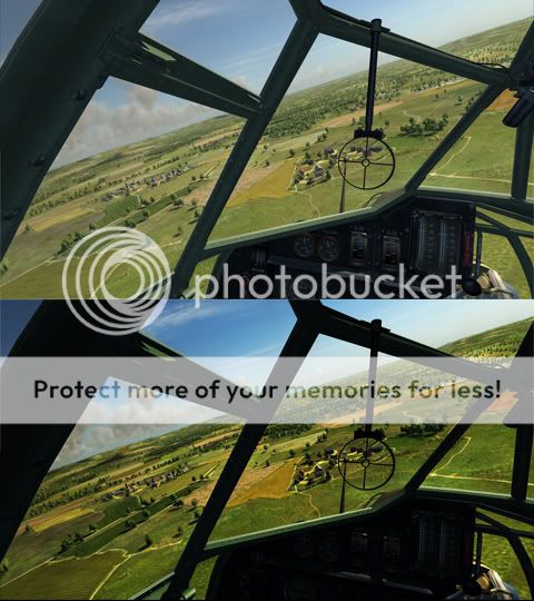
Your shots also illustrate why Oleg chose a low contrast per default: he found a good compromise that displays the sunlit landscape and important details hidden in shadows. The instruments are pitch-black in the high-contrast image. Our eyes have a dynamic range that is far greater than that of any machine. In real-life, sitting in a plane we see both the landscape and the instruments without problems, and without having the feeling that there is no contrast. To achieve this in a game, or in photography, you have to lower contrast. IMO Oleg did the right thing here.
|
Sorry, I don't see your solution solving the problem, in fact what you are doing is creating an unreadable set of instruments in the cockpit.
Look at how black the cockpit is in your shots.
The fact is, this is a game, there is no automatic iris adjustment possible for your eyes to make when you look down at the instruments. The gamma levels have to stay the same for both the exterior and interior.
In real life your eyes adjust to give a proper exposure. The game doesn't.
Which means to get a realistic exterior/interior balance, the developers need to tone down the exterior colours to represent what would be seen by the eye. Right now they are leaving them at the type of iris opening level which an eye adjusted for the cockpit would see. So they look overexposed and washed out.
Game needs to be adjusted.
By the way, the vote in favour of a change is now 3-1.

 04-09-2011, 09:00 PM


 Threaded Mode